Call Ozdachs at 415.347.6479|info_request@ozdachs.biz

6 Top Gifts for Your Techy Geek Friend

My personal Christmas list is often too geeky for my family and friends to believe.  I want software and utilities and tools that make my time at the computer easier, more interesting, or more fun.

If I asked for games, especially if I wanted them to run on an Xbox or Wii, people would understand what is on my list.   Instead I hear, “I can’t get you that!   It’s too much like work.  Shouldn’t you buy that yourself and declare it as a business expense?”

To support my fellow geeks… or to give hints to the family and friends of geeks, I’ll share the best 6 gifts that have been on my list:

  1. Kindle Fire from AmazonA Kindle… now a Kindle Fire.
    This is probably the easiest to understand, crossover-to-the-mainstream, geek gift.  Kindle is simply a great technology to take a lot of books with you on trips without getting overweight baggage fees, plus you can get new books on a whim in less than a minute via the Internet.
    Why is this a geek gift: Only a Kindle Fire is really geeky in 2011. Other Kindles are great, but really not geeky any more (sigh!). The Fire is 1st generation, controversial, color, and probably a lot of fun.
    Cost: $199.
  2. ESET Smart SecurityESET anti-virus and security system.
    By now everyone knows that they need an antivirus program on their computer, and ESET’s software is the best in class.  Experts say that ESET watches for and protects against all of the known evils, and in our house it protected my computer against a virus that got on to other computers that were running a different anti-virus program.  Plus, ESET’s products run very quickly and don’t take over and slow down your computer as others do.
    Why is this a geek gift: Your geek probably has months left on their old anti-virus subscription. Giving them a better security solution without waiting until the Norton (or McAfee or whoever are using) expires is a geek luxury!
    Cost: $59.99 a year.
  3. A WordPress blog hosted by Blue Host.
    WordPress is the free software that drives this blog and many of the most popular ones on the web, and Blue Host provides one-click installation and updates.  It’s the easiest to use that I’ve found.
    Why is this a geek gift: Your geek wants to share their wisdom.  Giving them a hosted blog not only will let them sound off, they’ll get to tinker, download, and tune the many add-on customizations available for WordPress systems.
    Cost: As low as $6.95 a month for hosting.  The WordPress software is free.
  4. Dreamweaver.
    Fire your web designer and do it yourself!  Dreamweaver is the industry-standard web page authoring tool.  Your techy person can show their artistic design side while geeking out on the latest in scripts, panel layouts, and even mobile formats.  Hours and hours and hours of work… I mean fun.
    Why is this a geek gift: Complex, robust, and top-of-the-line software. Give this to your Geek for Christmas and you won’t see them again until Ground Hog Day.
    Cost: $399. Ouch!
  5. Photoshop Elements.
    An eye for photography with Photoshop ElementsEveryone wants to edit their photos, and most of the free software does a tantalizingly okay job.  Photoshop Elements is a more satisfying group of commands and functions than the free programs.  The industry standard in photo editing is Photoshop, and Photoshop Elements is a sub-set of commands that will let you do anything a mere mortal — not a photography god — will want to do.
    Why is this a geek gift: Your geek will be able to create custom mouse pads, touch up photos for Facebook, and create a whole new visual reality.  What fun!
    Cost: Currently on sale for $89.99
  6. Food for Your Hungry Neighbors.
    In our balance budgeting frenzy, government grants to local food banks have been cut back or cut out.  Too many people are un- or under-employed, and don’t bring home enough money to feed their children and themselves.  If you can afford to give your geek something, but there’s nothing that they trust you to buy, then donate a nice gift to your local food bank in their name.
    Why is this a geek gift: Because geeks are caring people.  Really!
    Cost: 100% of what you can afford.
    Give to your local food bank

May you and your geek have a very warm and happy Christmas, Kwanza, Hanukkah, Yule, and Solstice.

By |2011-12-14T13:20:33-08:00December 14th, 2011|Computers and Hardware, Tips and Resources|1 Comment

Postcards from the Edge

I am currently working on two web sites which were originally created by graphic designers. They are very pretty. Pretty enough to be postcards. But, they also are inflexible and difficult to work with. To me, they are postcards from the edge of web design purgatory.

If you’re about to hire a web designer, make sure that they are not proposing to take a postcard-perfect graphic and make it the template for your new site design without agreeing that the site will be flexible and will comply with industry standards.

The postcard web page designs I am working with were originally created in Photoshop or GoLive. Unfortunately, taking the great look from a design package like Photoshop and making it into an HTML/XHMTL web page is not something that these programs do well. Even though the software brags about its ability to output an HTML page from the graphics, it does it poorly.

These programs make their pages with tables and slices of images to construct the backgrounds and borders for the web page. Although the pages they produce claim to be standards compliant, they are not. For example, one design I am editing specifies that it is compliant with the XTML 1 Transitional standard, but it uses a non-compliant “height” attribute on table cells to achieve the spacing between its various page components.

Yeah, that’s pretty technical and the value of valid XHTML code is a subject for another post. But, here’s something that I can show visually.

These postcard web pages were designed to be a specific height. The graphic designers each dislike scrolling down web pages so they oriented them horizontally and limited the space on each page for text. If there is more text or graphics on the page than initially conceived by the designer, the page falls apart.

Here’s how one of the pages looks when only a small amount of text is typed on the page. It looks great:
Web page with limited text

But here is how that same page looks when “too much” text is added to the page, “too much” being more than fits in the fixed-size gray block:
Web page with limited text
Rather than making a template ready for expanding text, this box design disintegrates apart when additional lines of information is added to the page.

Web pages must be able to expand downward. You cannot guarantee that all the information on a topic will fit into a set number of words. In fact, top-ranking pages in Google generally have over 400 words on it, and that much information won’t fit on most postcards.

In addition, you can see that the photograph of the adorable boy is created in three slices. This means if the site owner wants to create new pages using a different photograph or change this photograph, a web designer would have to slice the new photograph into three slices of the exact same size. That’s at least three times as much work and it’s also a mess to track.

The situation was very limiting for the site owner who contacted me. He couldn’t add more pages or information to his website, and he wanted to tell web visitors about his expanding business.

He liked the colors and looks of the site created by the graphic designer, but he wanted his web site to attract and inform potential clients.

Standards compliance validatedI was able to re-create the look of the page while using standards-compliant XTHML code. The column with the picture no longer breaks apart if the text on the right side shrinks or grows. New pages with new photos can be added easily.

As I write this, the new design is just live and the site owner and I am considering what information we want to add first. He has sample cost and cost-recovery spreadsheets to share, photos of his installation and equipment options, more information on options for residents and businesses. Look at this San Francisco solar power installation site, and see how the one-static postcard design now will support growth.

Graphic designers can create excellent looking web designs. If you engage a graphics person, I recommend one of two options. First, ask your graphics designer to agree to creating an expandable, XHTML, css standard-compliant site. If they don’t understand your request or say that they don’t be bothered with standards, ask that they create just the design. Then take the layout to a web designer for a XHTML, Cascading Style Sheet (css) web template.

The prettiest postcard sites will disappoint you if they don’t attract new clients and tell people about your business. Don’t be afraid to be as opinionated about the web site’s functionality as you are about its visual appearance!

By |2009-09-13T07:21:34-07:00September 13th, 2009|Search Engine Optimization, Web Design|1 Comment

Photoshop Done So Well, It Needs a Disclaimer

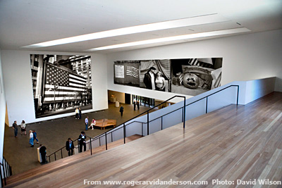
Roger Arvid Anderson photographic show as envisioned by David Wilson

One of my clients, the sculptor, photographer, and artist Roger Arvid Anderson, had a fun reason to add text to his website recently.

Visitors to his site who were reading a proposal for a Star Spangled photo exhibition were contacting him saying that they liked the photos of his show.

The mock-ups that seemed to show visitors strolling through galleries of Roger’s photographs were being mistaken for actual photos.  So, Roger asked me to add a disclaimer under the first of these Photoshopped pictures to say that the images were digitally manipulated.  Check out all the photos yourself!

Nice to have to such quality work on his site that we needed words to tell people that what their eyes were seeing wasn’t real.

Roger is an art photographer who still uses black and white film. He relied on photographer David Wilson to digitally create  such a realistic gallery.  I have worked with David for a couple of clients, and always appreciate his clear, interesting images. I recommend him whenever you need a professional to capture (or create!) a perfect image.

By |2010-11-21T16:06:36-08:00July 28th, 2009|Sample Clients|2 Comments
Go to Top