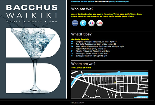
A Business Card Site That Does it Right
When you publish a one-page website that functions as an online business card you have a critical design challenge. You’re publishing one page that has to do the work of a whole site with many pages.
It has to:
- Look Good
- Give all the basic information of your business:
- who you are
- what you do
- where you are
- when you’re open
- why someone should patronize the business
I recently published a site conceived and designed by a client that does a great job announcing the business on the Internet.
Who, what, and where are explicitly explained in headlines.
The “what” and “why” are made obvious by the left-hand panel which slowly rotates through a series of photographs of cocktails and happy people. The slow slideshow skillfully enhances, rather than distracts, from the site’s message.
In addition, the page gives visitors a way to get more engaged with the business with links to its Facebook page, Twitter feed, photos on Flickr, and YouTube videos.
My hat is off to John of Bacchus Waikiki’s brain trust who laid out and gave me the specifications for the page and also provided most of the text.
Check out Bacchus Waikiki’s site yourself.

