The Tale of Two Websites
Websites are worse than ties. You can really tell when you’re looking at last year’s fashion.
It’s not just shifts in aesthetic whim. Technology allows looks and functions that were not possbile earlier. For example, when people were on dial-up or slow DSL, websites had to have small pictures to minimize download time. You still have to watch the speed of your website, but you can safely use pictures that are two or three or four times the size recommended back in 2004.
Then for a while sites had a boxed look with sidebars to get more information on the page. Now, navigation menus drop down from the top of the page, sliders rotate graphics featuring different topics, and there’s a more open feel. Within a single page you’ll have a mixture of one-column, two-column, three-column or more-column layouts. You’ll have tabs that when clicked will reveal paragraphs of descriptions, and you can incorporate bullet-points that expand when selected.
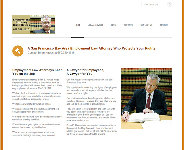
See what I mean. I just redid a website for employment attorney Brian Hawes. I used the same content in both sites, except for an updated picture of Brian and the addition of client testimonials.
Before
After
Visit the updated Employment Attorney Website.
The new site looks much cleaner, clearer, inviting, and 2014-ish! In addition, the new site is responsive, meaning the layout changes to better fit different screens such as smart phones, tablets, and traditional desktop computers.
Fortunately, updating a site using exising material doesn’t require that the business owner take new photos or dream up more content. The same material can be transferred to the new look.
However, for the web designer a new site can take as much effort as putting up the site originally. Putting content into tabs, diving text into columns, or using the graphic quotation marks for testamonials requires more than simple cutting and pasting.
The designer will have to stage the site at a test location and then move it to the live location when it’s done. Plus, we have make sure that incoming links to old pages are good. Either we have to use the same page names in the new site (e.g., “lawyercontact.php“) or else redirect visitors to the new version of the page (e.g., “http://www.haweslawfirm.com/contact/“).
But, updating your site is important and worth the investment. You want your business to look modern. You want to tell the visitors about your services in an attractive way.
Go ahead. Tell them you’re ready to serve them in 2014.


