Call Ozdachs at 415.347.6479|info_request@ozdachs.biz

I Met Etsy and Survived

One of my clients, Barbara Sebastian, is an artist and she journeys from show to show, displaying her pottery and other works of art. Periodically she sends me updates to her show calendar and I post them to her old tech website. We have done this for several years. But not now in the COVID-19 world!

There aren’t any in-person art shows in California. They’ve been postponed or cancelled.

It’s a scary time for artists who make money showing off their work at live gigs around the state. There are no appreciative crowds wandering through booths on lazy weekend afternoons, impulsively — or studiously — buying an elegant jar, teapot, or mural.

Raven Loves Persimmons Teapot

Raven Loves Persimmons Teapot
by Barbara Sebastian
See it on Etsy

Barbara mentioned that her friends had been suggesting that she open up a store on Etsy. As a dedicated technophobe, she said she had resisted using Etsy.

But, given the lack of live shows she asked if I would set her up online, using the nice photographs she had of 11 of her works.

I happily agreed to get SebastianArtStore up on Etsy.

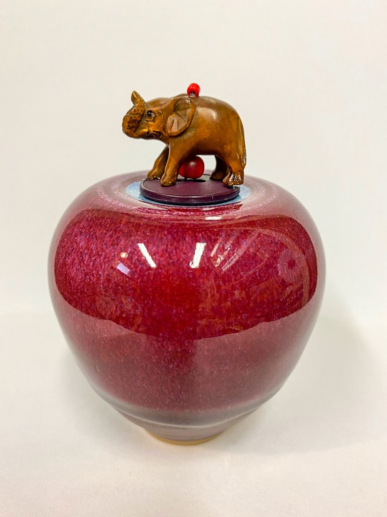
Elephant on a Jar

Elephant on a Jar
by Barbara Sebastian
See it on Etsy

I typically avoid helping with e-commerce sites, mostly because I don’t want the stress of managing a mission-critical website. (I had enough midnight phone calls and lost weekends when I was programming dispatching systems for police and fire departments.)

But, because Barbara is selling original works on a site designed for arts and handicrafts, I felt that the risk of midnight calls is low.

The good news is that Etsy is fairly easy to use. Slightly editing 11 pictures in Lightroom, uploading them, and entering the descriptions of the artwork itself took only a couple hours.

The screens are repetitive and there are some annoyances. For example you have to select your unit of measure (inches, feet, meters, etc.) for height, width, and length separately from drop down boxes, and you have to do it again for every item — there are no defaults or memory. Yet, when you get to describing the packaging dimensions to estimate shipping costs, the system allows only inches.  And, on the day I was entering the inventory, every time you hit PUBLISH for a new item you got an error message about a field being left out. But, if you hit PUBLISH again, the item went live.

Anomalies like this would probably throw off someone not comfortable with tech, so I am glad I could help Barbara out.

It really wasn’t very difficult, and I think the online presence looks good.

So, if you are an artist or a craftsperson who needs a virtual place to sell in this COVID-19 world, checking out Etsy is reasonable. Give it a shot.

In the meantime, Barbara’s work is great. Check it out!

By |2020-07-25T13:57:09-07:00July 25th, 2020|Client Sites and Actions|0 Comments

A Business Card Site That Does it Right

When you publish a one-page website that functions as an online business card you have a critical design challenge. You’re publishing one page that has to do the work of a whole site with many pages.

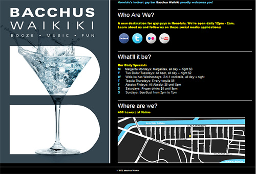
Honolulu's Premiere Gay Bar's One-Page Website

One-Page Website for Bacchus Waikiki

It has to:

  • Look Good
  • Give all the basic information of your business:
  • who you are
  • what you do
  • where you are
  • when you’re open
  • why someone should patronize the business

I recently published a site conceived and designed by a client that does a great job announcing the business on the Internet.

Who, what, and where are explicitly explained in headlines.

The “what” and “why” are made obvious by the left-hand panel which slowly rotates through a series of photographs of cocktails and happy people.  The slow slideshow skillfully enhances, rather than distracts, from the site’s message.

In addition, the page gives visitors a way to get more engaged with the business with links to its Facebook page, Twitter feed, photos on Flickr, and YouTube videos.

My hat is off to John of Bacchus Waikiki’s brain trust who laid out and gave me the specifications for the page and also provided most of the text.
Check out Bacchus Waikiki’s site yourself.

By |2012-03-13T18:06:10-07:00March 13th, 2012|Client Sites and Actions|0 Comments

Catering to a Caterer: Search Engine Optimization at Work

In my opinion, web design should include optimizing the pages for search engines.   There should be no need to employ a second professional to make a site  show up in search results.

But, apparently most web designers consider search engine optimization something separate from site creation. Just last week I worked with a local caterer whose professionally developed site was invisible on Google and other search engines. I am beginning to understand how business that specialize in Search Engine Optimization can make money.

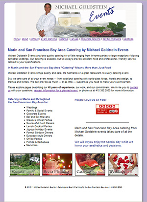
Marin Caterer for the San Francisco Bay Area:  Michael Goldstein

Michael Goldstein Events Updated Home Page

The original designer had put up a fine looking site, but there were no words on the site to tell Google what the pages were about.  I take that back: every page had the same title with “catering” the third word of the page title. But, that was it.

The site mentioned the type of events the business catered, like weddings.  But the word “catering” was not emphasized in the visible text on the pages.  None of the images had ALT tags — HTML code that describes pictures for the visually impaired and for search engines — with the word “catering”.

So, as far as Google was concerned, the site could have been about “wedding chapels” or “wedding planners” or “wedding dresses”.  Maybe the site could have been in results  “wedding food” or “wedding chef”, if anyone searched for those terms.  But, for “wedding catering”, the site was not going to show up.

We decided to try to attract searchers for:

We also decided to try to show up when people searched for “Marin” and the catering terms listed above.

Our changes went online Monday, and the search engines have started to respond.  Google already lists 3 terms in its top 10 results,  5 in the top 20, 7 in the top 30, and 10 in the top 100.

This morning I tweaked some pages to help more terms, and we’ll be monitoring this first round of optimization for the next couple months.

Real people are starting to notice the site, too.

Before the site was updated, we tracked visitors for a few days and saw that no one came from searches for “catering” on the Internet.  When anyone used Google to find the site, they searched for the business by name.  So, they weren’t looking for catering services, they were looking for Michael Goldstein Events catering.

When I looked at the statistics this morning, some people had come to the site after checking Google for “catering” or “Novato catering”.  It’s just a trickle of visitors at this point, but it’s a start.

I remain surprised that so many web designers can publish sites for business clients that don’t appeal to search engines.  When I create a new site for a client, I don’t charge extra for optimizing the site for visibility on Google.  I incorporate good search engine techniques as part of making the overall design.  I think all web designers should do the same.

But, until they do, I’m happy to help businesses with under-performing web sites get into search engine results!

Creating a Competitor’s Site

Marin Trust and Estate Attorney Marlene Getchell recently asked me to help her publish her new web site which was being designed by branding specialist and graphic designer Kristi Frelkin.

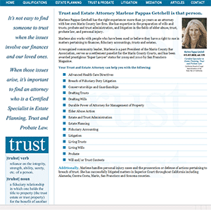
Web Design for Marin Estate Attorney Marelene Getchell

Site for Marin Estate Attorney Marelene Getchell

Kristi propagated the look of Marlene’s other marketing materials into a web design, and I received PFD’s of each page which I published as Search-Engine-readable HTML pages.

I enjoyed the challenge of being shown a picture and being told, “Make me one of these!”

Working for Marlene also posed another challenge:  I was already working for Marin Estate Planning Attorney Julia Wald.  I have helped Julia become #1 in Google searches for 5 terms, including “Marin Estate Planning Attorneys”.

In fact, when we first met, Marlene told me that she and Julia were competitors for some type of business.  She asked if I would have a problem helping her with her web site.

Yes, normally I would decline an engagement from a competitor to an existing client.  There is only one #1 position in Google for any given set of keywords, and I don’t want to choose among clients about who I best promote.

I agreed to work on Marlene’s site only for one reason:  Julia recommended me to Marlene and told me that she thought I should help Marlene.

With the client’s approval I felt comfortable helping another estate attorney get online.

Fortunately, Marlene and Julia have different focuses, although there are many clients who could benefit from either attorney.  Julia’s ideal client wants to create an estate plan while Marlene enjoys litigating disputes.  Julia’s most important keywords are “Marin estate planning attorney” while Marlene is looking for traction on “Trust and Estate attorney”.

I am careful not to suggest a marketing strategy to Marlene that I developed with Julia, and vice versa.  They may be friendly competitors, but I want to separate the accounts as much as possible!

The good news, of course, is if you are looking for an attorney to help you with your estate issues, I know two great ones.

By |2011-03-15T10:58:10-07:00March 15th, 2011|Client Sites and Actions|0 Comments
Go to Top