Call Ozdachs at 415.347.6479|info_request@ozdachs.biz

About Ozdachs

San Francisco Internet Marketer and web designer gets you on the Internet in a cost-effective, responsible way.

The Cobbler’s Children Get New Shoes


Original Ozdachs WebsiteOur business website looked great when it went live in 2002. It was modern, clean, quick-to-load, and full-featured. We did updates and edits throughout the years, but the basic layout and functionality was rooted in standards and technology of the early new century.

The original home page is shown on the right (and click on the picture to go to the actual old site).

But, we’re not in 2002 anymore. It was way past time to create an updated Ozdachs.biz, and we were happy to go live with a new look in early July.

Here are 4 major changes we made… and ones you should consider doing, if your site is 16, 10, or even 6 years old!

Responsive Design

Responsive design means that your site responds (displays) differently depending upon the layout and size of the user’s screen. Graphics will change size and columns will break differently depending on what type of device your visitor is using. Your pages will look different on desktops, tablets, and cell phones.

For some industries, over half of all website visitors are using their cellphones, so making pages that look look and work well on small screens is important.

Responsive design lets your web pages display on the phone without making the user scroll or manually resize the screen. Users like responsive sites a lot. They don’t like to have to scroll left and right to see what’s there.

  • Moreover, Google ranks sites that are NOT responsive lower in search results. If you’re hoping that new visitors will discover your site when they look up your keywords on Google, you need to have a responsive site.
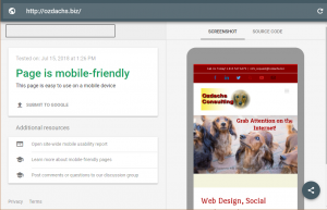
 

Mobile Test Results for Ozdachs.biz

Want to see if your current site is responsive? 

And then see if the small formats are user-friendly: Use Google’s free testing tool.

Larger and More Complex Graphics

Fifteen years ago web designers had to worry about the size of photographs and functional code on their site because download speeds were low. Remember the hot technology of DSL? The top DSL speed  was 128 kilobits per second to 3 Megabits per second (Mbps). Big pictures, maybe 8 Megabits in size, could make your website take forever to display.

Most people now get 10, 20, 100, or even 1000 Mbs from their Internet Servic Provider!

Users and search engines still care about speed, and Google boosts your site in search results if it loads in a reasonable amount of time.  But, with speeds 100 faster than they were a few years ago, images can be larger and you can do some fancy displays with pictures and text.

You want larger photos and more interesting graphics — properly focused, they grab the attention of your visitors.

WordPress for Code Management

Initially all of Ozdachs’ sites were simple HTML sites with maybe some JavaScript written for navigation or simple image swapping. To publish a site or to make changes, you had to have a What You See Is What You Get (WYSIWYG)  HTML authoring tool like FrontPage or Dreamweaver on your computer. You’d make your changes locally and then upload the HTML code to your hosting service.

Now, up to 30% of website are developed using the open source code management system WordPress. WordPress is constantly being updated and improved. Third parties are writing tons of plug-in applications to increase the functionality of WordPress sites. In addition, scads of developers have created templates that sit on top of WordPress and let you apply and extensively customize prefabricated websites and web pages.

WordPress sites live on the hosting service, not on any one person’s computer. With proper security, your developer or you can update your site content from anywhere with an Internet connection. You do your edits using a web browser. You go to your site, enter in your authoring credentials, and make your changes. There is no special software required on your computer.

WordPress originally was known for supporting blogs like this one. But, now entire sites are built on WordPress.

Ozdachs uses WordPress —and currently the Avada template — for most of its clients. The choices of looks and features which can be selected is rich. Our web design home page shows a selection of client sites, and all but one of them are WordPress sites using Avada.

Frankly, we couldn’t offer the range of looks and functions to our clients without relying on whiz-bang products from third parties. Developers and companies are producing more reasonably-priced tools for the WordPress platform than for any other offering. So, we are WordPress fans.

HTTPS Protocol

When your old site was created, chances are your hosting service only delivered pages to visitors using Hypertext Transport Protocol, and the site’s address in web browsers showed up as “http://www.yoursite.com”.

The standard now for websites is now Hypertext Transport Protocol Secure or HTTPS.  This means that your website’s connections with your visitors are encrypted and that your site has been verified as real by a third-party issuer of security certificates. Check out this discussion of what HTTPS is and why you want it.

Most of Ozdachs clients collect no sensitive data from their visitors. Getting a security certificate and delivering content by HTTPS might seem like overkill.

However, Google threatens to penalize all sites that are not HTTPS by displaying them lower in search engine results. And, also, some of your users will be reassured by seeing the padlock icon and a “Secure” indication in the browser’s address field when they use your site.

We decided to pay for a upgraded SSL certificate for our business site so visitors know we know the technology and understand that we can be trusted.

Check Out Our New Shoes

That’s it! Our four big changes:

    1. Responsive Design
    2. Larger and Complex Graphics
    3. WordPress Base
    4. HTTPS protocol

The leap from a 2002 look and a 2018 website is a big one.

We like the fancy look look of our new shoes.

Check out Ozdachs’ Internet Consulting business site, and let us know what you think and if you have any questions on what we’ve done.

Internet Consulting and Web Design New Site

By |2018-07-24T11:01:31-07:00July 15th, 2018|Tips and Resources, Web Design|0 Comments

WiFi Mesh “Systems” for 2018’s WiFi Networks

Streaming television services, connected lights, iPads and Chromebooks, and smart devices are becoming common, even in non-techy homes and businesses. Their growing use has made WiFi coverage throughout your home or office a necessity.

When we first installed WiFi, we had one router that reached in the back part of our building where the computers, iPhones, and the Netflix box were usually located. WiFi was weak in our front rooms and garage, but we were rarely in those locations looking for the Internet..

But then iPhone apps and Amazon Echos changed our needs. Our response was to get a WiFi extender, but to be honest, that solution was not great. We had to teach every device the main WiFi name, “REDDOG”, and its password.  We had to teach every device about the extended network names, “REDDOG-EXT1”, and passwords.

As we carried our phones and other WiFi devices from room to room, they had to switch from network to network, and the hand-offs were often flawed.

Linksys Velop Mesh System

Linksys Velop Mesh System

About a year ago we switched technologies to a Mesh System. With a mesh system you connect your first unit to the ethernet from your ISP’s modem and configure the connection using a phone or tablet app. Then you plug in additional units around your home/property and quickly tell them via the app to join the WiFi network they are extending. These extenders use the same network ID, “REDDOG”, and password as the original unit.

This means that your phones, tablets, and other devices don’t have to learn many different network names, and they don’t have to switch networks as you move them around.

In our experience, the mesh network has been noticeably more reliable and easier to set up and maintain. In addition, the mesh network is faster and has tri-band capability, which has allowed us to stream video and audio to different devices simultaneously.

These systems are a bit more expensive, $300 for two units, instead of maybe $150 for a base router and $100 for a WiFi extension.  But, as you discover more WiFi devices you “need” to use in the corners of your home or property, the mesh network solution is clearer superior to other options..

We bought a Linksys Velop two-unit system from Amazon a year ago, and it’s been reliable and trouble free. When we disrupted the network by making bad decisions on some setting changes, Linksys’s free support quickly helped us get back up.

So, we recommend the Velop. It looks like the Linksys is also first choice of PC Magazine.

PC Magazine Mesh Network ratings

PC Mag has more information on mesh networking — good geeky reads And, the best prices for Velop Systems still seem to be at Amazon.

We are telling our friends and clients to go mesh!

By |2018-04-24T11:12:35-07:00April 24th, 2018|Computers and Hardware|1 Comment

Facebook is Sharing Data? Shocking!

The main question I have about Facebook allowing apps to collect (and keep) user data is, “Who didn’t know this was going on?”

Seriously? You play the FB games to learn which celebrity you’re most like or what your “real” age is or what your personality IQ is, and you don’t think that someone, somewhere devised the quiz for a commercial purpose? You get asked questions about your habits, likes, and dislikes, and you don’t suspect that the software is collecting data about you for some reason?

When you click to play/answer a quiz you’re told that the app is going to have access to all sorts of your personal information, often including your contacts. You have to say, “Okay”!

Hootsuite Login ScreenPerhaps the most obvious collectors/sharers of data with Facebook  are the other websites and services that allow you sign into them using your Facebook (or Twitter or ….) accounts.
You have to agree to let them see and use at least some of your Facebook information as part of the login process. Did you think that these other sites and applications were not getting information about you and your habits from Facebook at the same time they were telling Facebook what they knew about you? Again, seriously?

Facebook — and many other social sites, games, and apps, are free. They sell ads like the free old-time television. But, they know more about you than the broadcasters who sent the same commercial to everyone in America. Apparently people didn’t expect that Facebook would use the knowledge they have to sell more ads and make more money.

Facebook has made mistakes. It said that it didn’t share information when it had, and it didn’t get back information from places like Cambridge Analytica it said it would. And, Mark Zuckerberg and others have dissembled on the topics of privacy and data sharing.

But, I worry about the uproar focusing on Facebook and the follow-on idea that you can pass data storage laws that are going to keep your information safe on the Internet. Laws and a contrite Facebook are not going to keep your views, demographics, and interests private if you publish them online. And, if you take a poll/survey/test for the fun of it, you have to expect that the hosting site is doing something with your information.

We are each responsible for determining what we want the world to know about us and we should expect others to react positively, negatively, or commercially to what we share. Frankly, I thought this was understood by all of us Internet-savvy folks including Facebook users, bloggers, and Pornhub contributors.

The New York Times published a handy list of commonsense steps you can take give yourself marginal protection on Facebook, and most of their advice applies for other sites and apps.  Read it and take their suggestions.

But, really. The outrage over Facebook’s “data breech” sounds a little like the indignation and surprise of the bordello piano player. I don’t need Mark Zuckerberg to testify in front of Congress to know what’s being going on upstairs in the rooms.


By |2018-03-27T08:39:34-07:00March 26th, 2018|Facebook, Social Media|1 Comment

So, How Does Malware Get on Your Computer?

No one intentionally installs an application that is going to encrypt their files until they pay a ransom, log their keystrokes and report their bank passwords to crooks in Russia, or hijack their web browser to show ads instead of the sites they want to go to. Bad guys have to trick you into going to some web site, looking at an infected message, or clicking on a link to allow them to download their toxic programs.

Basically, YOU have to give the jerks permission to infect your computer.

You’re not likely to click on a button that says, “YES, Download your malware and steal my identity!” Button Requesting Malware

So the people who want to get inside your computer send you clever, urgent messages to get you to unleash their poisonous computer code on your computer. Frankly, the inventiveness and smart marketing techniques these folks use are praiseworthy.

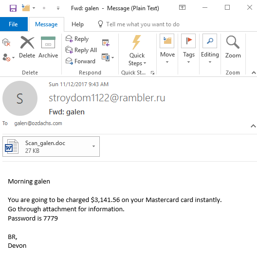
Here’s the invitation to be a sucker that arrived in my email yesterday:

Scam Email

Look!  My Mastercard is going to charged instantly! (A classic injection of urgency to get someone to act NOW!)

I can see the details of this instant charge — and also unleash the evil software embedded in the Word document — by simply clicking. I mean, who wouldn’t want to know why their Mastercard is about to be charged a hunk of money?

Well, probably someone like me who doesn’t have a Mastercard. But, more importantly, YOU!  Even if you have a Mastercard, you should be in the habit of NOT clicking to open attachments or follow links on emails you’re not expecting.

In this case, the scammers messed up somewhat by showing a return address of stroydom [email protected].  That’s an email address without a name, and the “.ru” means it supposedly comes from is from RUssia.  If they’d been smarter, they would have used a generic From name and spoofed the return address, something like “Sarah Jones <[email protected]>”.  Even better would have been spoofing the name and email address of someone I know, if that had access to my email address book.

Every day I get messages trying to trick me into clicking a box or a link that would instruct my computer to let the would-be hackers install their evil code on my system. Then they could take over my machine and lock up my data for ransom… or do something more subtle like watch me login to my bank’s website so that they can learn my password. Many of these attempts are stopped by my email’s spam/malware filter, but some get through.

Here’s what the latest attempt to hoodwink me reminded me:

  • Don’t click on anything in an email unless you know the person who sent the email AND you were expecting a message from them.
  • Use Chrome or other browsers who warn you if you try to go to a site on their dirty list.
  • Use up-to-date antivirus software. That will block the downloading and installation of evil programs… so long as the antivirus program knows about it.

Follow these guidelines and don’t get shocked into clicking where you should’t!

A $3,100 unexpected charge on your Mastercard? Don’t panic. And, don’t click!

By |2017-11-13T15:36:42-08:00November 13th, 2017|Scams|0 Comments

The Dress’ Color and Your Website

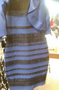
Dress whose color people cannot agree on

Gold and White… or Blue and Black… this dress is one color for you and the other color for 50% of the population

This picture went viral when it was posted on Tumbler along with the question, “.. is this dress white and gold, or blue and black?” Everyone who viewed the dress thought that the question was silly.  For half of the people the answer was unequivocally gold and white. The other half were equally sure that the dress was blue and black.

Personally, I first saw it as gold and white.  I couldn’t understand how anyone could see anything else.  Then I came back from being in a dark room, and the picture had magically changed.  The dress was definitely blue and black.

There are great explanations of why different people see different colors.  I particularly like Wired‘s discussion of the science behind the different color perceptions.  They even analyze the strengths of the different hues in each part of the dress and come up with a “scientific” answer.

However, as a web designer, I don’t need a right or wrong, definitive color ruling. I don’t think there is a single correct answer.

The whole discussion illustrates one of the problems I explain to clients. You cannot control precisely what a visitor to your website will see.

The dress photograph shows that people simply perceive things differently.  The same swatch of color may look red to you and green to me.  The settings of our individual monitors may differ.  The background images on our monitors may contain different colors that affect our judgements.  Our room lighting may be lighter or darker, or more blue or yellow. Or, our minds just interpret colors differently.

All of these variables make it extremely difficult (i.e., impossible) to develop a web page that looks the same to all visitors.

This doesn’t mean that you cannot design a clean, clear site that 99% of visitors find pleasing.  It just means that sometimes you have to breathe deeply and give up the desire to control the entire user experience.

I have spent hours making minor color adjustments for some clients — architects and designers are particularly particular.  They get angry because a color that looked like a perfect blue on their office screens appears too purple when they get home.  I explain that the monitors’ settings, ambient lighting, and even the viewer’s mood disrupt a uniform experience.  Colors and looks on the Internet are not as controllable as they are on a printed page.  Often, the client acts like I am trying to shirk from a difficult, but possible, task!

So, I love the picture of dress.  If you cannot give up absolute control of the user experience on your site, I can always ask if you want me to use a gold and white combination like the one the dress. Or, is that a blue and black combo?!

By |2015-03-06T09:12:27-08:00March 6th, 2015|Web Design|0 Comments
Go to Top