Call Ozdachs at 415.347.6479|info_request@ozdachs.biz

About Ozdachs

San Francisco Internet Marketer and web designer gets you on the Internet in a cost-effective, responsible way.

Feature the Customers You Want to Have

Last week one clients talked to me about changes in her business-to-business industry.  Instead of relying primarily on one type of client, say cat owners, she has determined that in the future the real money will be spent by clients in a different category, dog owners.

My client has done some work with dogs, but most of her web pages picture cat toys and catnip because traditionally her money has come from cat owners.  She has more experience with cat owners, and has a long list of happy cat projects. Still, she knows that in this economy cat owners are foregoing services like hers while dog owners are increasingly leveraging her work to improve their competitiveness.

She asked me about updating her web site to attract dog owners.

Puppy and Poppies

When you're selling to dog owners, your site has to be all about puppies.

Great!  Her site should appeal to the clients she’s determined will be most profitable.

When she spoke with me, she said that the wanted to show up in dog owner’s Google searches.  She suggested that we mention dogs a couple times on her site. She said she didn’t expect pages about dogs on her site, because she knew that historically she had served cats and she didn’t want to mislead future customers about her work.

Growl!

When we update her site, we are not going to just mention dogs.  We’re going to put dogs on the home page and create at least one new dog page. The site is going to howl!

Visitors want to see themselves on the web pages of businesses they are reviewing.  They want to know that the organization is focused on people like them.  They don’t care about history, they care about current services.

To attract the people we want as clients, we need to picture in words and graphics customers just like the ones we want to have.

  • When a church wants to increase the number of families with children, its web site needs to show children playing.  If the only images on the pages are of elderly people in the pews, young parents are going to click away.
  • When a community group wants to increase the ethnic diversity of its members, it needs to show people of all colors participating.  If the only images on the pages are of white people talking together, black and brown people are going to click away.
  • When your company wants to sell more to dog owners, you web site needs to show puppies frolicking.  If the only images on the pages are of cats, dog owners are going to click away.

Your prospective clients want to feel comfortable with the companies they do business with.  They want a connection.

Show them that they belong with you.


By |2011-06-27T11:54:58-07:00June 27th, 2011|Marketing, Web Design|0 Comments

When the Facebook Tail Wags Your Business Dog

Friday night I went to a concert by a well known San Francisco community group.  They’re talented. Although they are a non-profit volunteer group, the back orchestra tickets were $25, and the show was well attended.

Of course, the organizers want people to keep with the group’s future concerts and events, and they’re on top of social media.  So, they naturally pushed their Facebook page.  The master of ceremonies suggested that people take photographs during the evening, post them on Facebook, and compete for prizes for the best photographs.  The concert program even suggested when photographs should be taken.

Instructions from the Concert program to take a photo and post it on Facebook

Instructions in the Concert Program

So, after the house lights dimmed, audience members starting turning ON their cell phones and snapping photos.  Folks were maneuvering in their seats for the perfect angle, holding their phone up and out, and snapping away.  The man in the row in front of me really got into the spirit by starting the video camera and he recorded a section of the performance.

  • Cell phone displays are very, very bright.  In a dark hall, they are somewhere between distracting and blinding.
  • Some cell phone cameras flash in dim light.

The benign suggestion to share the performance online with your friends interfered with the experience for people who had already were fans. At the intermission and the end of the show, our group talked about the flashing and lights and not about the music.  Professional theaters ban pictures and videos both because their concern about intellectual property rights AND they don’t want amateur paparazzi disrupting their shows.

There’s a lot of good will for the organization sponsoring the concert I saw, and I doubt that their misplaced suggestion that people take pictures will impact their following.

But, what a good lesson for your business on what you should and should not to do!

  • Use social media to build buzz and get people in your doors.
  • Use social media to get your customers to tell their friends about you.

Do NOT let Social Media distract or de-focus your customers from doing what you want them do:

  • When I am already at a concert, don’t degrade my current concert experience in attempt to get future clients.
  • If I am already in your business, don’t suggest I check social media for deals or future events.

Just like in so many other areas of life, the bromide of “Moderation in Everything” will help your business use Facebook successfully.

By |2011-06-19T10:26:35-07:00June 19th, 2011|Facebook, Social Media|0 Comments

A CAPTCHA that Works

I’ve written about the CAPTCHAs that are getting more and more complex — so complex that soon they’ll be comprehensible only to other computer programs that were created simply to defeat the CAPTCHA. (See my Philippic on bad CAPTCHAs).

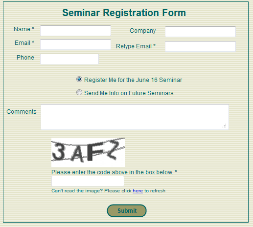
So what is a reasonable way to keep forms from being filled out by automated programs?  Right now I am voting for a simple-to-read CAPTCHA like the one used by San Francisco CPAs Sterck Kulik O’Neill for their business growth strategy seminars.

Business Growth Seminar Registration FormAs Sterck Kulik O’Neill’s web master, I was copied on the email generated by their old, FrontPage form. There was no protection, and spammers frequently filled in the form with their own sales messages.

A couple months ago I switched out the FrontPage form with a clean, simple form built with tools from Simfatic Forms.

Even though I overrode the default settings in the tool and made the CAPTCHA only 4 characters and I decreased the number of interfering lines down to 2, we have received no spam “registrations”.  The form, its field edits, and its simple CAPTCHA are doing their job… and clients are signing up for the seminars without reporting any frustrations or problems.

Of course, the seminar page is a low-priority target for spammers seeking to break into a site.  The information on the form isn’t being posted anywhere on the Internet, it’s just being emailed to the site owner.  So, high-powered spammers with the latest character recognition programs have not yet tried to exploit the form.

And, unfortunately, the CAPTCHAs in Simfatic’s tool are not ADA compliant (people with visual impairment have no option to click to hear the CAPTCHA read to them). So, we have to make sure that there’s a phone number or alternative contact method available for visually challenged people to register.

Still, for the small business web site, the simple CAPTCHA is a good, common-sense solution.  Check it out!

By |2011-06-15T09:55:24-07:00June 15th, 2011|User Interface, Web Design|0 Comments

How LivingSocial is Anti-Social

Our favorite local restaurant alerted me to its upcoming” $50 of food for $25″ deal on LivingSocial.  So, I went online yesterday and signed up on my iPhone.

I will buy the deal for Eurkea when it shows up.  But, ugh.  LivingSocial itself is pretty much a mess:

  • There’s no obvious way to change your password. When I signed up yesterday on the iPhone I picked a simple password, intending on making it more secure when I was at my desktop and had access to my random character password generator.  Now I don’t see any link to change what I first entered.  Nothing in their help search for “change password” either.Okay, LivingSocial… but don’t expect me to store a credit card or other sensitive information with you!
  • Their “recommend a friend process” is cheesy.
    • The LivingSocial recommendation page asks you to enter your friends’ email addresses.  They show you the spammy message that they’ll send to your friends, but you cannot change it.

      “Hey, have you checked out LivingSocial’s Daily Deals? Each day, you get an email with huge discounts to restaurants, spas, museums, and more — all for 50-90% off!

      I’m already a member and this is your invitation to join. It’s free — just click on this link to sign up. You’ll immediately get 5 Deal Bucks, and I’ll get 5 Deal Bucks when you buy your first deal.”

      That’s not my style, so I won’t be sending friends recommendations.  (Okay, if you write and ask, I’ll put in your email address.  But, I won’t spam unsuspecting friends with LivingSocial corporate chatter.)

    • The graphic at the top of the page implies that you will receive $5 credit for just sending an email message inviting a friend to join. That’s unreasonably generous, but, that’s what they’re offering, right? Wrong!  The real offer is “When a friend uses your link, they’ll get 5 Deal Bucks to help them buy their first deal. Once they do, you’ll get 5 as well!”  That’s reasonable, but it is not what the graphic says.

    LivingSocial Refer a Friend Offer

    LivingSocial Refer a Friend Offer

  • LivingSocial wants you to live in Los Angeles. Very “Ugh!

    “When I signed up on my phone yesterday, I gave the app my permission to use my location, presumably so it would send me local deals.  Instead, it showed me current San Francisco Bay deals, but subscribed me to the deal emails for Los Angeles.There doesn’t seem to be a way to pick a home city.  Instead, I clicked around and discovered that I could un-subscribe from LA deals and instead ask for San Francisco deals.   The process isn’t intuitive, and I am not sure most people would work that hard.

Services like LivingSocial who are playing catch-up to dominant players (Groupon, in this case), have to give consumers a reason to switch to them.  LivingSocial is offering only an inferior user experience.  I signed up because I’m looking forward to saving $25 at Eureka.  But, once that’s accomplished, Groupon is going to be site I spend my bargain hunting time!

By |2011-06-12T09:59:44-07:00June 11th, 2011|Social Media, Tips and Resources|1 Comment

Don’t Let Your CAPTCHA Get in the Way of Your Business

CAPTCHA examples from LastPass forumsMore and more sites are using CAPTCHAs (Completely Automated Public Turing test to tell Computers and Humans Apart) to keep spammers from registering on web sites, from posting phony comments on blogs, and from generating in-bound breast enhancement messages on forms.

I approve of CAPCHAs in general because they are simple for site users and they cut down on bogus messages, both those publicly posted and those sent to the business owner from a form.

But, enough!

CAPTCHAs are not going to be 100% effective against determined spammers, and efforts to increase the effectiveness of the CAPTCHA test has crossed the line into driving visitors away from doing useful business on some sites.

The CAPTCHAs on the right are full-size copies of ones I copied from my screen this morning when I was registering for a forum on the LastPass web site.  Once I completed the registration form, I would be sent a confirming email to activate my account — another validation step to prove my humanness.  But, I couldn’t get the CAPTCHA right in my first 6 tries.

But, look at these images!  LastPass is doing more than protecting itself from automated comments in its forums, it is driving away real-life users.

These CAPTCHAs are simply too difficult to read.

  • The colored characters are too well camouflaged by both the background color and background pattern.
  • The characters are ambiguously drawn.  8’s and B’s, numeric 0’s and alpha o’s  are possible answers for some of the drawings. How is the user supposed to know which o/0 to choose?
  • There are a variable number of characters in the images.  This makes me wonder if the CAPTCHA-generating routines were working, or if some of the CAPTCHAs are simply faulty and impossible to answer.
  • These CAPTCHAS are particularly hostile to people with visibility issues.  I am not colorblind, but the use of red and green images is plain nasty.  And, unless you blow up your screen, the images are sized for the eyes of the young.

LastPass provides great functionality and responsive customer service, but they’ve joined so many organizations in over-CAPTCHAing their web sites. And, they are far from the worst offenders.

Craigslist is at the top of my list of  CAPTCHA-crazy sites.

Admittedly Craigslist is a very juicy target for spammers and outright criminal frauds.  But, their CAPTCHAs are ridiculous.
CAPTCHAs from Craigslist
The images on the right are ones Craigslist offered to me this afternoon when I was going to post an event for my church — information about the Sunday service.

Before seeing these images, I have had to register with Craigslist. Registration includes providing them with:

  1. An email address which they validate.
  2. A telephone number which they contact with a validation code. The automated message from Craigslist comes into my phone and gives me a numeric PIN which I have to type into a validation page on the Craigslist web site.

So, with Craigslist, I have to have an active account with a checked email address and a validated telephone number.  THEN every time when I want to post an event, I have to type in a CAPTCHA.

And, look.  Some of the CAPTCHAs have foreign-language characters. Others are too blurry for me… maybe an automated character recognition program could read and type in what’s presented by Craigslist, but I can’t!

Time for Dangerous Common Sense for CAPTCHAs

CAPTCHAs are intended to make sure real humans are filling in the forms. But, soon only the character-recognition programs will be able to decode what the CAPTCHA-generating programs have created.

It’s nuts.

Designing your web site design for determined crooks is not good business!  Focusing on the crooks will cost your web site legitimate business.  Pass it on!

By |2011-06-09T12:57:04-07:00June 9th, 2011|User Interface, Web Design|0 Comments
Go to Top