Call Ozdachs at 415.347.6479|info_request@ozdachs.biz

About Ozdachs

San Francisco Internet Marketer and web designer gets you on the Internet in a cost-effective, responsible way.

Don’t Send Me This If You Want to Keep Me as a Customer!
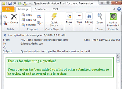
My Shopper App's Automated Reponse to Automated acknowledgements can reassure clients that their message has been received and will be responded to when you’re back in the office.

Other automated messages, like the one above, convey disinterest and unhelpfulness.  Getting no response is better than getting a message like this.

Worse, this email was the only answer to my support request when I checked my mail the next day.  When I saw the message in my inbox I expected that it was going to be the actual answer to my problem.

Folks, don’t tell me that you’ll get back to me “at a later date”.  Geeze!  The next day after never is a “later date”.  If you have to, tell me something concrete yet far away like “within 10 working days”.  Or better yet, hire enough people to quickly respond to your clients (adding staff actually can increase your profits because like Costco and others you get more business;  read the research).

Moreover, telling me that I am one of many questions waiting around for an answer is not reassuring.  It doesn’t speak well about the quality of  your software, nor does it make me feel like a individual, valued customer!

I responded to this automated message with something like a “Huh? What does this mean?”  Miraculously enough, the reply-to address worked, and after an hour or so I received a real answer to my original question. They told me to do something on my iPhone that I don’t know how to do, but it least their real response gives me something to work on when I have the time.  I have no idea how long I would have waited for even this information if I hadn’t responded to the automated message.

This company fell victim to a common problem.  They saw an available technology (auto-response email messages) and used it.  They should have remembered this Ozdachism:  Just because a technology exists, it doesn’t mean you should use it!

By |2012-03-22T16:32:28-07:00March 22nd, 2012|Tips and Resources|0 Comments

When You Don’t Want to Hire Me

I had a difficult conversation with a potential client this month.

The man has some unique and valuable collectables that he no longer enjoys, and he would like to instead enjoy the money from selling them. He also decided that he wanted to offer the goods via a Dutch auction where the prices start high and are periodically dropped until someone buys or a reserve limit is reached.

He and I discussed what he had to do to get ready to display his items, and he described the type of site that he thought would best show off his goods.  He also admitted that he had a very limited budget, at least until some of the articles sold.  I said that I would research Dutch auctions to see what support there was available on the Internet for such a site.

In considering his site, I was really concerned about getting enough traffic so there would be bidders for the goods.

I worried that even a gorgeous, feature-rich site which had been tuned for search engines still would not capture many visitors. There wouldn’t be enough potential bidders for a successful Dutch auction, particularly because the items for sale were specialty, expensive collectables.

I spent some time researching Dutch auctions, Dutch auction software, and sites that ran Dutch auctions.  I was focused on finding a way to boost traffic for the potential site. I found a Dutch auction service that allowed individuals to set up stores within it, and each store could run its own sales and they would be listed in the overall auction directory. The main online page was a bit cheesy, but it looked like you could customize your store and have your goods show up on a shared index.

Exploring a customized Dutch auction store on this service was my recommended course of action for the client.  The service had built-in features to display products for sale, it was inexpensive, it had some measure of built in traffic.  I suggested that he contact some of the other virtual store owners — ones not selling competing items — and see if they were satisfied with the service.

The potential client didn’t want to go with my recommendation.  Instead he wanted me to create the customized site he envisioned.

I couldn’t do it.

The store owner had too many conflicting constraints and wants:  low cost, customized storefront, lots of visitors, no budget for Google AdWords, complete operational control.

He didn’t want to settle for the solution I thought was possible for him.  That is absolutely fine.  But, in my heart I was convinced that I could not make him happy.

And, that’s exactly when you don’t want me to work for you.  When you or I or both of us feel that you ware not going to be happy with what we do together, you shouldn’t hire me.

By |2012-03-21T11:23:05-07:00March 21st, 2012|Web Design|0 Comments

A Business Card Site That Does it Right

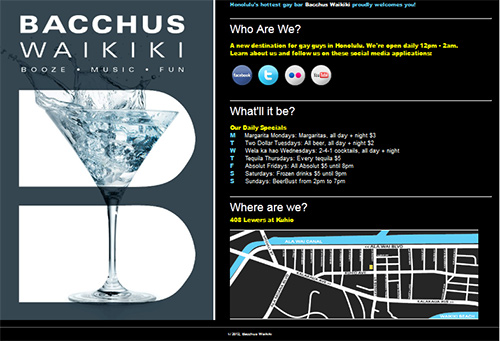
When you publish a one-page website that functions as an online business card you have a critical design challenge. You’re publishing one page that has to do the work of a whole site with many pages.

Honolulu's Premiere Gay Bar's One-Page Website

One-Page Website for Bacchus Waikiki

It has to:

  • Look Good
  • Give all the basic information of your business:
  • who you are
  • what you do
  • where you are
  • when you’re open
  • why someone should patronize the business

I recently published a site conceived and designed by a client that does a great job announcing the business on the Internet.

Who, what, and where are explicitly explained in headlines.

The “what” and “why” are made obvious by the left-hand panel which slowly rotates through a series of photographs of cocktails and happy people.  The slow slideshow skillfully enhances, rather than distracts, from the site’s message.

In addition, the page gives visitors a way to get more engaged with the business with links to its Facebook page, Twitter feed, photos on Flickr, and YouTube videos.

My hat is off to John of Bacchus Waikiki’s brain trust who laid out and gave me the specifications for the page and also provided most of the text.
Check out Bacchus Waikiki’s site yourself.

By |2012-03-13T18:06:10-07:00March 13th, 2012|Client Sites and Actions|0 Comments

How to Organize and Edit Your Photos Like a Professional

I have 53,990 digital photographs on my computer that I have taken for vacation, for business, and for just the hell of it.  Or, I have downloaded them from stock photo sites or other legal spots on the web. The shots are scattered in different folders throughout my disk drives.  Finding a specific image when I want to illustrate a web page or include a visual clue in an email has long been a challenge.

Over the years I have used a lot of different systems to store my photographs in places that I’d know to find at later.  I’ve created sub-folders with dates and topics and themes.  Unfortunately, these storage spaces are scattered over different drives in folders called My Pictures, Images, Old Images, and more.  In fact, most of my client folders themselves have dated and tagged sub-folders, and I cannot quickly explain the division among the top-level folders of “Clients”, “Clients Old”, and “Clients Traditional”.

Finding a photograph of a specific person or scene that I know I have taken can involve a lot of searching. Did I file it by the project or by the date? And, has it become “old” or “traditional”?

Then, when I find the photograph, it’s usually the wrong size. Or, maybe there’s a stray person in it who needs to be cropped out.

Until last November, my experience with photo indexing and retrieving tools had all been negative.  Sporadically I downloaded several trial products and freeware solutions, but nothing both located all of my pictures and let me find them easily.

Years ago I gave up on free or low-cost photo editing software.  Nothing let me do enough fixing of flawed pictures, and I broke down and bought the industry-standard — and expensive — Photoshop program.

I thought there was nothing in the market that was both effective and reasonably priced to help with day-to-day photographic workflow.

I am happy to report that I am now wrong both about organization software and editing programs.  I stumbled across Adobe Lightroom 3 last fall.  It was recommended by John Ater, the professional photographer whose GroupOn photo shoot session I enjoyed.  John said that he, a professional, used Lightroom to organize his photos and he said he did 95% of all of his photo correction using Lightroom alone.

Lightroom works for me, too.  I use it to store, find, resize, and edit most of pictures I touch in my personal and professional lives. It does a great job of finding images computer-wide by their file/sub-folder/folder name and it also searches successfully by the tags I have started to add to my graphics.  Once I have found the image I want, I can crop and fix the coloring or lighting.  Then I can change the image’s size, and post it to Facebook, Flickr, or save it in another folder for uploading to a site.

That’s all I need to do 95+% of the time.

Adobe released Lightroom 4 earlier this year. They’ve added features like better video handling, and they’ve cut the price in half.

Lightroom 4 now costs only $149, a fraction of the $699 for Photoshop. Plus, it does the organization of photo collections that Photoshop doesn’t do.

I am switching my recommendation for personal and web photographers.  Check out Lightroom.

I think Lightroom is the best reasonably priced program that will keep you on top of your pictures.  And, like most Adobe products, you can try it for free for 30 days.

By |2012-03-11T18:53:23-07:00March 11th, 2012|Tips and Resources|0 Comments

Know The Truth About “Domain Name Search Engine Registration”

Sleazy Domain Registration Service Email

Sleazy Domain Registration Service Email

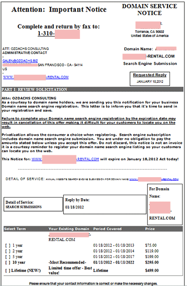
There is a special circle of hell reserved for people who send emails like the one reproduced at right. These are the scary-looking “NOTICES” that take advantage of a business person’s unfamiliarity with the technical terms of the Internet.  The messages try to get an unsuspecting website owner to buy a horribly overpriced, maybe worthless, service.

This particular email was sent to me on January 17th asking me to reply by January 18th.  The sender is creating a false sense of urgency to get me to act before I figured out what I was doing.

The formatted electronic letter says it’s a “Domain Service Notice”.   It looks like the senders are trying to trick you into thinking that you need to renew your site’s domain name registration.  Domain name registration is a real service. Domain name registration is what records you as the owner of your www.ozdachs.biz and tells everyone on the Internet where to go to see the site.  Domain name registration for .com domains currently costs under $20/year from reputable registrars.

This message is not selling domain name registration.  They are offering “Domain name search engine registration.”  I don’t know what that is.

I suspect that it is a made up product with no commerical value for your website.

You don’t have to register your domain with places like Google or Bing.  Those search engines find and read all of the pages of your site and put you in search results for free.  You can submit your site to Google, but that really isn’t necessary.  Google will find your site through in-coming links from other sites it knows about.  (You have to make sure that your site gets pointed to, but that isn’t difficult.  Writing a public post on Facebook or in a blog like this is enough!)

At most, you might submit a new website to the major search engines to try to kick-start its visibility.  Most experts don’t think you need to do this, but the search engines generally let you tell them about your site.  For free.

In any case, I cannot think of a reason why you would need to submit your site more than one time, when it is new.  Google and the other search engines regularly revisit the sites they’ve found to process and reindex the new content that’s published.

This come-on letter offers you a one-year “registration” for $75.  The senders say their “best value” is a lifetime service for $499.  I have no idea what you get for multiple years of the service.

Unfortunately some people will fall for this urgent-sounding pitch. Its wording is carefully legal: it says straight out that it’s not an invoice and you are under no obligation to pay. But, the message is skillfully formatted and it looks so official!

Luckily this sleazy message came directly to me because I am listed on the real, official domain registration for a client.  My client didn’t have to panic, and he didn’t waste his money. I know what to do with offers like this: trash them!

If you have any questions about you get in your email or USPS box, talk to me or your webmaster.  Don’t pay for a service you don’t understand!

By |2012-01-31T11:25:20-08:00January 31st, 2012|Domain Names|59 Comments
Go to Top