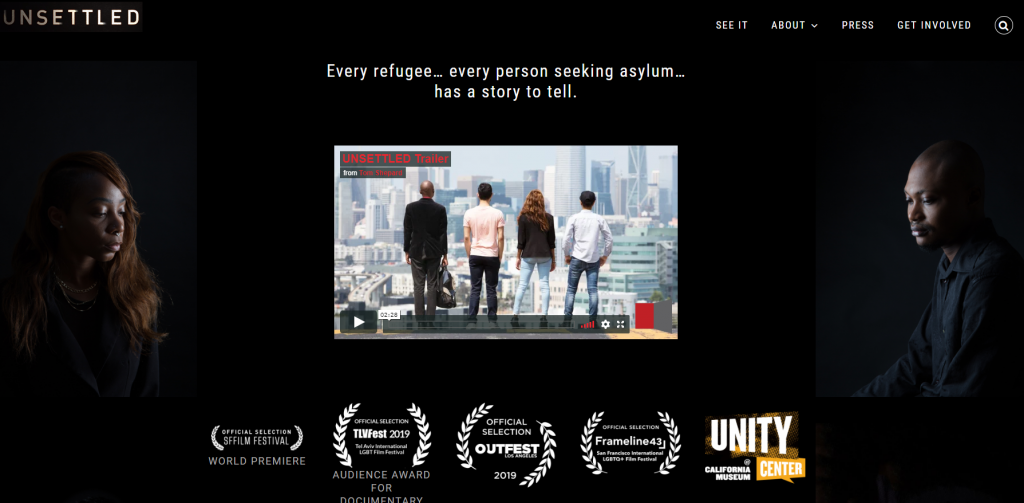
I am delighted that we went live Thursday with a website that showcases a new, important documentary film. UNSETTLED, SEEKING REFUGE IN AMERICA tells the stories of queer refugees and asylum seekers who had to flee their home country due to persecution and try to settle in San Francisco.
What made this website different from a development point of view is that the clients were filmmakers. They’re filmmakers with excellent design sense and ideas of how they wanted the site to look… pretty exact ideas of how they wanted the site to look, in fact!
In our first meeting they had a mock-up of the design they were looking for, a site structure, and ideas for the content on their pages. Most of my clients rely on me to suggest what pages they need and what should be on them. Not filmmakers Tom Shepard and Jen Gilomen.
So, instead of coming up with possible layouts and content for client approval, my task was simplified. I just had to find a way to get the Avada WordPress template I often use to accommodate the client’s desires.
This work reinforced my suspicion that Avada is very flexible. It allowed me to do the layout, color palate, and even the font selection that the filmmakers wanted.
I also learned that filmmakers are right up there with architects in their concern that the website be a spectacular representation of their aesthetics and commitment to quality. They wanted each website page to be as carefully framed as the scenes in their movie. Is the font size too large? Is the image too dark? too light? How far apart should the letters be spaced?
Fortunately, these are kind and calm filmmakers. They worried with good humor and kindness.
And, I didn’t sigh too loudly when they deleted any visibility (Search Engine Optimization) elements… like putting the film title in the page headlines or reiterating the subject of the documentary often enough to clue Google in on what a page was about.
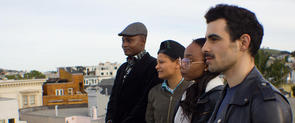
The subjects of UNSETTLED: SEEKING REFUGE IN AMERICA
Their site represents the look and feel wanted by the filmmakers. Their iterative updates all focused on getting the pages cleaner, leaner, and completely uncluttered.
From my point of view, this was an easy job. The clients didn’t hem and haw about the look they wanted. They’ve got The Eye. And, they communicated what they wanted clearly.
What do you think? Check out the site and let me know.
And, be sure to see if the film is playing near you. See it!


Thank you very very much for caring about human life. That’s something that is to this day sorely lacking in this world and I would say that the very act is far far far more beautiful than the website could be.
I know very well what it’s like to suffer and have people subject misery on others. One of the ‘others’ was me when I was growing up. I Pity them though that took many many years for me to be able to do so. I am a better person for it. Yet I have always called out abuse of others. Yet refugees are another class entirely who are in desperate peril so the fact people still do care is amazing and precious and extremely beautiful.
I gather that you are American and I have to say that fair or no it’s even more special: because the stereotype in the case of tolerance and openness etc. with Americans is unfortunately from what is very visible and in historically too. Yet once again this is a perfect example of how reductionism is dangerous and unfair and it makes it impossible to understand those who are being targeted by reductionists – a sadly large proportion of the world. People are extremely complicated and nobody is only ‘good’ or ‘bad’ with the keyword being ‘only’ or ‘just’. We’re all another creature with a story to tell and things to offer the world if only given the chance. Everyone could end up doing things that are questionable if in similar circumstances and this should never be forgotten. Sadly it is.
And if that dog is yours: it’s really beautiful!
Cheers.