I’ve written about the CAPTCHAs that are getting more and more complex — so complex that soon they’ll be comprehensible only to other computer programs that were created simply to defeat the CAPTCHA. (See my Philippic on bad CAPTCHAs).
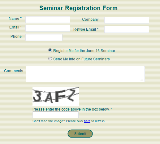
So what is a reasonable way to keep forms from being filled out by automated programs? Right now I am voting for a simple-to-read CAPTCHA like the one used by San Francisco CPAs Sterck Kulik O’Neill for their business growth strategy seminars.
 As Sterck Kulik O’Neill’s web master, I was copied on the email generated by their old, FrontPage form. There was no protection, and spammers frequently filled in the form with their own sales messages.
A couple months ago I switched out the FrontPage form with a clean, simple form built with tools from Simfatic Forms.
Even though I overrode the default settings in the tool and made the CAPTCHA only 4 characters and I decreased the number of interfering lines down to 2, we have received no spam “registrations”. The form, its field edits, and its simple CAPTCHA are doing their job… and clients are signing up for the seminars without reporting any frustrations or problems.
Of course, the seminar page is a low-priority target for spammers seeking to break into a site. The information on the form isn’t being posted anywhere on the Internet, it’s just being emailed to the site owner. So, high-powered spammers with the latest character recognition programs have not yet tried to exploit the form.
And, unfortunately, the CAPTCHAs in Simfatic’s tool are not ADA compliant (people with visual impairment have no option to click to hear the CAPTCHA read to them). So, we have to make sure that there’s a phone number or alternative contact method available for visually challenged people to register.
Still, for the small business web site, the simple CAPTCHA is a good, common-sense solution. Check it out!

Leave A Comment