 More and more sites are using CAPTCHAs (Completely Automated Public Turing test to tell Computers and Humans Apart) to keep spammers from registering on web sites, from posting phony comments on blogs, and from generating in-bound breast enhancement messages on forms.
I approve of CAPCHAs in general because they are simple for site users and they cut down on bogus messages, both those publicly posted and those sent to the business owner from a form.
But, enough!
CAPTCHAs are not going to be 100% effective against determined spammers, and efforts to increase the effectiveness of the CAPTCHA test has crossed the line into driving visitors away from doing useful business on some sites.
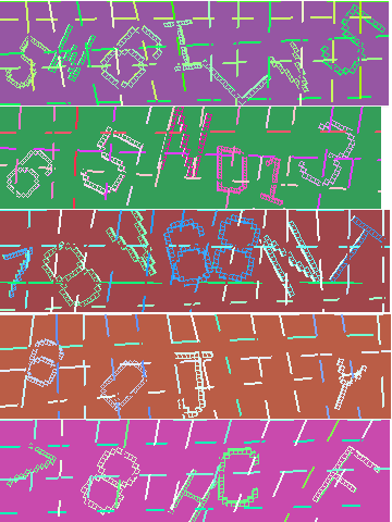
The CAPTCHAs on the right are full-size copies of ones I copied from my screen this morning when I was registering for a forum on the LastPass web site. Once I completed the registration form, I would be sent a confirming email to activate my account — another validation step to prove my humanness. But, I couldn’t get the CAPTCHA right in my first 6 tries.
But, look at these images! LastPass is doing more than protecting itself from automated comments in its forums, it is driving away real-life users.
These CAPTCHAs are simply too difficult to read.
- The colored characters are too well camouflaged by both the background color and background pattern.
- The characters are ambiguously drawn. 8’s and B’s, numeric 0’s and alpha o’s are possible answers for some of the drawings. How is the user supposed to know which o/0 to choose?
- There are a variable number of characters in the images. This makes me wonder if the CAPTCHA-generating routines were working, or if some of the CAPTCHAs are simply faulty and impossible to answer.
- These CAPTCHAS are particularly hostile to people with visibility issues. I am not colorblind, but the use of red and green images is plain nasty. And, unless you blow up your screen, the images are sized for the eyes of the young.
LastPass provides great functionality and responsive customer service, but they’ve joined so many organizations in over-CAPTCHAing their web sites. And, they are far from the worst offenders.
Craigslist is at the top of my list of CAPTCHA-crazy sites.
Admittedly Craigslist is a very juicy target for spammers and outright criminal frauds. But, their CAPTCHAs are ridiculous.

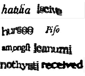
The images on the right are ones Craigslist offered to me this afternoon when I was going to post an event for my church — information about the Sunday service.
Before seeing these images, I have had to register with Craigslist. Registration includes providing them with:
- An email address which they validate.
- A telephone number which they contact with a validation code. The automated message from Craigslist comes into my phone and gives me a numeric PIN which I have to type into a validation page on the Craigslist web site.
So, with Craigslist, I have to have an active account with a checked email address and a validated telephone number. THEN every time when I want to post an event, I have to type in a CAPTCHA.
And, look. Some of the CAPTCHAs have foreign-language characters. Others are too blurry for me… maybe an automated character recognition program could read and type in what’s presented by Craigslist, but I can’t!
Time for Dangerous Common Sense for CAPTCHAs
CAPTCHAs are intended to make sure real humans are filling in the forms. But, soon only the character-recognition programs will be able to decode what the CAPTCHA-generating programs have created.
It’s nuts.
Designing your web site design for determined crooks is not good business! Focusing on the crooks will cost your web site legitimate business. Pass it on!

Leave A Comment