Since the middle of November Google has offered searchers a sneak peak of web pages in search results. This allows amped-up surfers a quick way to see if your site looks interesting enough for them to click on the link and visit you.
Obviously, having a page that looks good in preview will help you get visitors. Good news for Search Engine Optimizers like me, though. Suddenly, there is a whole new worry for web masters looking for traffic: how to tune your site for previews. (My original post on preview.)
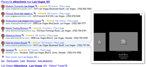
Today while considering the effect of previews in attracting visitors to a site, I stumbled across another feature (bug?) of Google preview: it does not display previews of pages that use Flash. Instead Google preview shows a boring gray square:
When you’re looking for things to do in Las Vegas and you see pictures of happy people, pools, and shows on most listings and see the black and gray squares for this site, where do you think you’re most likely to click for more information?
Google acknowledges what it’s doing to Flash pages and other animated pages. It says that Google preview:
… currently does not support Flash, Silverlight, or Java applets. Flash-based content may be shown as a “puzzle piece” in the preview image. Font-replacement techniques that use Flash are currently not supported.
Terrific!
So, here’s another reason to avoid Flash on your pages: they’ll look like little puzzles when potential visitors see the previews in Google’s search results.
Fortunately, none of my client sites use Flash in a significant way. But, if your site does use Flash, run to your web designer and tell them that you want to be seen on Google Preview.


Leave A Comment